New responsive blog layout
I wanted to make the blog layout responsive for a long time now, but since I don’t even own a smartphone,
this wasn’t really one of the top priorities for me. But then, the Jekyll 1.0 update came along, and I had
to rework the liquid templates anyway, since e.g. Jekyll now exports a post.excerpt variable on it’s own.
So I sat down and started hacking, and I ended up reworking a whole lot of the templates to match
Twitter-Bootstrap, which I ended up using for the responsive grid
of the site.
Reworking the site also improved IE 6 – 8 compatibility. I now use html5shiv and some conditional comments to adress various issues in old IE version, even IE mobile got some love.
Furthermore, the newsfeed is now an atom feed, which is much simpler to implement and maintain. Though creating an RFC 3339 date in liquid wasn’t as trivial as I thought (but more on that in another blog post).
Optical changes
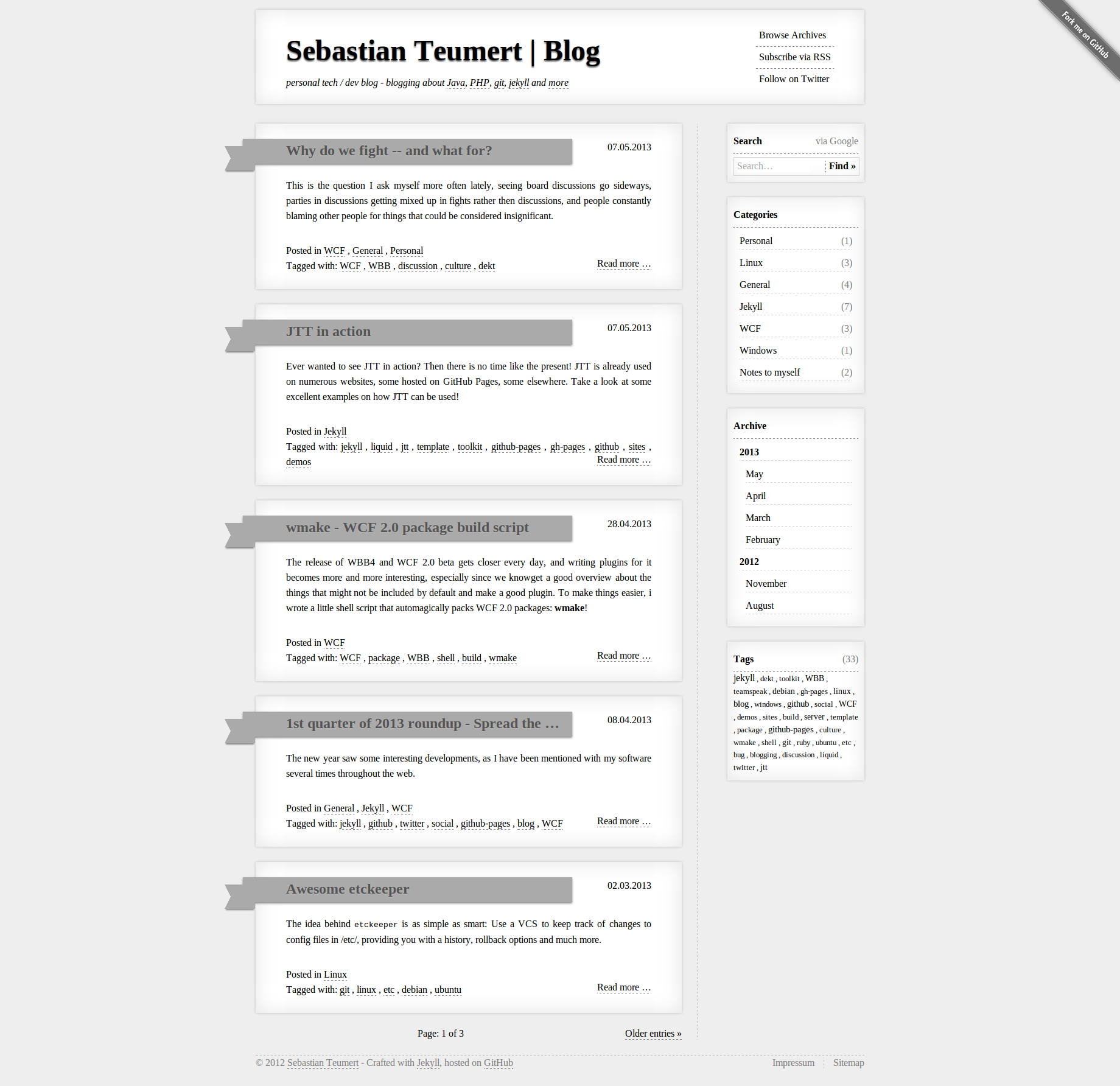
First of all I think i managed to maintain the overall look of the site, but on the same time giving it a fresh, and most importantly, more light-wheight look. The old design was good, but it wasnt responsive and it was a little bit too much focused on the “paper” style boxes.
In the new design, only the most important site content is emphasized by that box, and all other meta elements, e.g. the whole navigation in the sidebar, is much more inobstrusive. This puts a heavy emphasize on the actual article itself. Take a look on the picture for comparison:

I also got rid of the pure CSS ribbons. They were nice to play with, but from todays point of view too obtrusive, and they had a slight rendering issue if you zoomed in ad took a really deep look at them. Moreover, the ‘Fork me’ banner was moved to to sidebar mene, thus avoiding problems with responsiveness on mobile devices.
Something that is not visible at first glance is the printing style. While the old design already had a reasonable printing stylesheet (I hate it when I want to print pages, and I have to print most of the navigation, which is utterly useless on paper, so I made sure that when you print an article of my blog, you get exactly that - a well formed article on paper, only including the page header in order to highlight where the article originated from, the article itself, and the footer with the copyright notice, but nor the whole nav menu) and Twitter Bootstrap provides some printing support, I made sure that the print layout for the articles is really good, easy to read, and without elements that are pointless on paper. In my opinion, many people who talk about ‘responsive design’, which is to make sure ones website offers the optimal viewing experience on as many devices as possible, too easy forget about printers.
If you are interested in buying the old template (it got some nice critics), contact me.
Future
For future feature updates, I consider switching from the default rendering engine (maruku) to redcarpet 2 (has fenced code block) or kramdown (supports TOC generation and fenced code blocks highlighted via coderay), as well as adding MathJax for LaTeX / MathML support (there are some posts upcoming that use LaTeX).
Another feature update yet to come is to allow comments as issues on GitHub and displaying them together with each post. Though I am not sure if allowing comments like that is the right thing to do in the first place.